It’s in vogue that one would want custom presentation of certain items in one’s intranet for reasons of branding or usability. We have been hearing about view formatter and column formatter since couple of years. Those can be used as a powerful UI/UX feature in intranet sites built with Office 365, as Intranet may need some polished look and feel. However, there are limitations on what one can do with OOTB features and that’s not unusual.
The purpose of this blog is to demonstrate some use cases for conditional view formatting using JSON. Three particular cases are highlighted in this article.
Announcement
Assume that the customer wants to show latest announcement with optional hyperlink to some external or internal pages. The whole item including, title, description and start date needs to be hyperlinked. Consider the following OOTB Announcement.
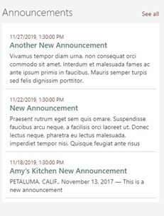
As such, this will only show the items that start before or equal to the current date and that end after or equal to current date. Apart from the title, there could be an optional description. The idea is to create hyperlinks on all these fields. To achieve this, one may decide to go with a custom list and create a view for this list with the following columns and conditions. Mark that only Title is the mandatory column. The situation is as follows.
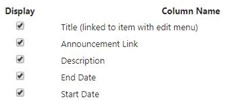
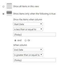
And now the view formatter comes into play for the look and feel. Start from a simple layout like below. The idea could be to simply put the containers with children into an ‘a’ tag like below.
- a
- div (contains the child items)
- div for Start Date
- H2 for Announcement Title
- div for Announcement Description
- div (contains the child items)
Hmm.. the trouble starts since within ‘a’ tag children contents are not supported in JSON formatter.
So consider making the ‘a’ tag absolutely positioned inside a relatively positioned wrapper of item view and move other items like Title, Description and Start Date into another div. Also ‘a’ tag needs to be conditional based on the presence or absence of URL value in the ‘Hyperlink’ column. So, add a condition in the ‘display’ property to block when there is any value in the column. See below,
{
        "elmType": "a",
               …
        "style": {
          "position": "absolute", // used for linking the whole item including, title, description and start date
          "display": "=if([$<Link Column internal name >] == '', 'none', 'block')", // used for not mandatory columns
…
         }}
And it works.
List with Group By Column
Imagine that the customer needs a single place from where depending on a given strategy the status for different goals and objective need to be seen. For each status there would be an icon. Consider the following.
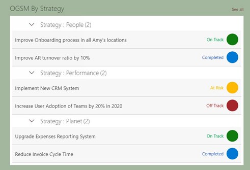
So, this becomes a candidate for a custom view of the list, with a group by “status”. Here a condition for each status with a text and colored circle with different color code is presented. Instead of colored circle we can use either UI fabric icons or an SVG icon.
For the conditional color coding the following may be used. Strategy and Status are the custom choice columns. “People”, “Performance” and “Planet” are values of “Strategy” column. The code may look like the following.
"attributes": {
              "class": "=if([$OGSMStatus] == 'On Track', 'ms-bgColor-green', if([$OGSMStatus] == 'At Risk', 'ms-bgColor-yellow', if([$OGSMStatus] == 'Off Track', 'ms-bgColor-redDark', 'ms-bgColor-orange')))"
            },
For using UI fabric icons, put the “iconName” as an attribute.
"attributes": {
                  "iconName": "StatusCircleCheckmark"
                }
If you are using SVG icons, you need to make sure that the icon has the proper dimension. Use the path element and set the path in “d” attribute of the element.
{
          "elmType": "path",
          "attributes": {
            "d": "M 13,6.5 C 13,10.089861 10.089861,13 6.5,13 2.910139,13 0,10.089861 0,6.5 0,2. …… "
          }
        }
Glossary
A typical glossary would appear as follows.
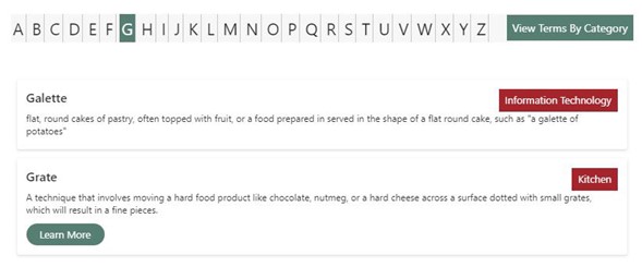
Let us consider that the user needed a glossary with the items consisting of Title, Description and a hyperlink to some external or internal reference to themselves. So, a custom list is created with the columns title, description (rich text plain) and hyperlink (image or URL). In addition, consider that there is a calculated column that stores the first letter of individual term of glossary. Then all the views filtered by first letter may be created and used in the list view web part. Finally, add some scripting with the script editor web part to show the individual view of letters.
The view formatter JSON is available with extracted PNP template and ready for provisioning. So, create more view formatter and have fun.
The idea of this whole discourse was to exemplify how you can use JSON formatting codes to customize your display and extend the ability to create views that are most appropriate in a given customer context. Innovate and win customer confidence.







Hi I am trying to have a read more option like i want to show two like then a read more option people clicks on it and it expand to show the more data is it possible in the JSON formation of a column