Preface
While the Modern SharePoint is aimed to make user experience more collaborative, users know well that visual customization is limited compared to its Classic counterpart. On one hand where Microsoft attempts to make the Modern SharePoint easy to manage and configure, an organization’s basic need to render its theme of colors, font or style is still posed with its own set of challenges.
Development of SPFX technology allows developers to experiment with customization of web parts. This not only limits the extent to functionality development, but also supports theme variants to allow configuration of section backgrounds.
Modern SharePoint page related terminologies specific to the context can be referenced here.
Introducing ‘CSS in JS’
For first timers, React is a well known JavaScript library for customizing the UI. The syntax extension in React, popularly known as JSX, equips developers to write markups in JS or TS and off late, and is also considered to follow the same path for CSS of components. Hence, the terminology ‘CSS in JS’ as it helps customization of SPFX in a minimum of the following ways:
⦁ No dependency on Saas compilers, hence assuring faster builds
⦁ Avoiding issues with CSS specificity
⦁ State-based styling or conditional styling based on props
⦁ Allowing renaming of classes
⦁ Supporting local scoping of components
⦁ Intellisense for coding and suggestions
⦁ Reuse of style and use of mixins, pseudo-classes/selectors, media queries, animations et al
Layout/Sections of a Modern SharePoint page
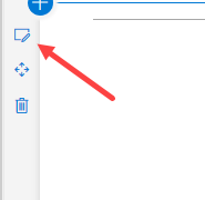
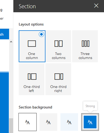
SPFX web parts started to support section background from SP version 1.8 onwards. Section backgrounds should not be a new term for veteran users or developers of the Office 365 intranet. Sections are divisions in the content area of a modern page where web parts – both OOTB or custom, can be added. Each section is independent of the other, and hence allows individual configuration of its background from its property pane as shown in the following screen shots.
In the properties the type of layout and section background color can be defined.
Understanding Semantic Slots
The OOTB configuration allows changing section background, called as ‘variants’. A variant can be one of the following four types – Strong, Soft, Neutral and None. For each variant, the SharePoint theme provides different colors for different semantic slots.
A complete list of generated colors in different slots in Theme generator can be viewed here.
SharePoint creates different color values with variants of section backgrounds, as indicated in the below image.
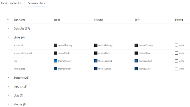
This blog focuses on the use of semantic variable “SemanticSlot.Link” as an example, to create different colors based on the section background color instead of a static theme color.
The scaffolding engine will create a component with its Props, SCSS and the class for the component.
Developing Web Parts with ‘CSS in JS’ tuned with Section Backgrounds
Updating manifest of the web part
The foremost step is to make point the theme to the web part theme by adding a property in the manifest.json file as below:
“supportsThemeVariants”: true
Adding and Using ThemeProvider service in the WebPart TS
// Import theme provider service
import { ThemeProvider, ThemeChangedEventArgs, IReadonlyTheme } from '@microsoft/sp-component-base';

...

// Create properties for both the service and the theme object and using the theme change event within the class definition

private _themeProvider: ThemeProvider;
private _themeVariant: IReadonlyTheme | undefined;

protected onInit(): Promise<void> {
    // Consume the new ThemeProvider service
    this._themeProvider = this.context.serviceScope.consume(ThemeProvider.serviceKey);

    // If it exists, get the theme variant
    this._themeVariant = this._themeProvider.tryGetTheme();

    // Register a handler to be notified if the theme variant changes
    this._themeProvider.themeChangedEvent.add(this, this._handleThemeChangedEvent);

    return super.onInit();
}

/**
 * Update the current theme variant reference and re-render.
 *
 * @param args The new theme
 */
private _handleThemeChangedEvent(args: ThemeChangedEventArgs): void {
    this._themeVariant = args.theme;
    this.render();
}
The above code is responsible for consuming the ThemeProvider Service and handling the event for changing section background. So now for using this consumed theme variant object within the component as a Prop. In our case it is “currentThemeVariant” as shown below in the render method:
public render(): void {
    const element: React.ReactElement< IThemeVariantsDemoProps > = React.createElement(
      ThemeVariantsDemo,
      {
        description: this.properties.description,
        currentThemeVariant: this._themeVariant
      }
    );
    ReactDom.render(element, this.domElement);
  }
Creating ‘CSS in JS’
A complex web parts has a global CSS with a general structure, like a wrapper ‘div’ and a component specific CSS, known as SCSS controlling all its UI. However, the flip side is the increase in build time with the increase of number of SCSS on the page and also inability to write state based styling or conditional styling in “.module.scss”. Hence the need to replace SCSS with ‘CSS in JS’ by performing the following sequence of steps:
Deleting the SCSS file
Delete the SCSS from the web part component which reduces the build time for minifying CSS and compiling SASS.
Creating the global style TS
Create a TS file (within a common folder in SRC) containing a style constant and import the style in the component. Using a TypeStyle library helps to generate maintainable CSS by typescript like “TypeStyle”. Following are its features:
⦁ TypeScript based with great intellisense
⦁ Rich API – mixins, pseudo-classes/selectors, media queries, animations etc.
⦁ Fast and compact in size
⦁ Generates unique CSS class names
My preferred third-party library is the “TypeStyle” Library, that caters to the needs for maintaining the pseudo states and media queries by using an Style function instead of default style attribute. Other details can be checked here.
npm install typestyle –save
However, any other library can also be used.
Using the theme in Global style
In module SCSS we can use the same theme color that is used by the site with the variables from fluent UI e.g. color: $ms-color-themePrimary; But here we are not using the SCSS.
Instead of SCSS, create a ThemeVariantTypeStyle.styles.ts file in a common location and paste the following
import {stylesheet} from 'typestyle';
import {IReadonlyTheme} from '@microsoft/sp-component-base';
export const createstyles = (theme: IReadonlyTheme) => {
  return stylesheet({
    root: {
      backgroundColor: theme.semanticColors.bodyBackground,
    },
    title: {
      color: theme.palette.themePrimary,
      fontSize: theme.fonts.large.fontSize
    },
    subTitle: {
      fontSize:theme.fonts.medium.fontSize,
      color: theme.semanticColors.bodySubtext,
      FontWeights: theme.fonts.medium.fontWeight
    },
    description: {
      fontSize:theme.fonts.smallPlus.fontSize,
      color: theme.semanticColors.bodySubtext,
      FontWeights: theme.fonts.smallPlus.fontWeight
    }
})
}
On the above the Theme variant is used as a parameter of a function that returns the stylesheet. Here “root” is the top- level container. You can use Typestyle in a lot of possibilities if you know CSS (https://typestyle.github.io/#/). Also observe the use of theme.semanticColors.bodyBackground and theme.palette.themePrimary. A collection of theme values can be used to programatically style components.
Refer to Microsoft’s documentation on ITheme Interface.
Packaging things within component.tsx
After setting up the Theme provider and the global style, package to use all the stuff within the component, by performing the following steps:
Importing the global style
import {createstyles } from ‘./ThemeVariantTypeStyle.styles’;
Adding the theme variants for Fabric UI controls
Fabric UI controls already use the palette and the semanticColors property insome cases. Fluent UI have provided IStyleProps and IStyles interface for most of the controls, which you can use programmatically to change the look and feel of the controls, like how in this example, the TextField and Button controls are modified to use properties from theme variant object as below. Another thing to note here is, unlike SCSS conditional styles can be used. That is one of the additional benefits of using CSS in JS.
const {semanticColors} = this.props.currentThemeVariant;
    const ButtonStyles = ({
      root: {backgroundColor: semanticColors.buttonBackgroundChecked},
      rootHovered: {background: semanticColors.buttonBackground}
    })

const textFieldStyles = (props: ITextFieldStyleProps): Partial<ITextFieldStyles> => ({
    root: {
      borderBottomWidth: '2px',
      borderBottomColor: semanticColors.primaryButtonBackground
    },
    ...(props.focused && {
      root: {
        borderBottomWidth: '2px',
        borderBottomColor: semanticColors.primaryButtonBackgroundPressed
      },
      field: {
        backgroundColor: semanticColors.primaryButtonBackgroundDisabled
      }
    })
  })
For the focused state of input the conditional style is used above. Observe the use of semanticColors from the current theme variant that is being passed as a prop of the component.
Creating a constant for using the global styles.
const styles = createstyles(this.props.currentThemeVariant);
Wrapping up
After creating a few constants in the web part component, it is now time to use them in the render method of the web part component
return (
      <div className={ styles.root }>
        <div className={ styles.container }>
          <div className={ styles.row }>
              <span className={ styles.title }>Welcome to Theme Variants!</span>
              <p className={ styles.subTitle }>Customize SharePoint experiences using Web Parts.</p>
              <p className={ styles.description }>{escape(this.props.description)}</p>
              <TextField label="Required" styles={textFieldStyles} required />
              <DefaultButton text="Standard" styles={ButtonStyles} onClick={this._alertClicked} allowDisabledFocus />
          </div>
        </div>
      </div>
    );
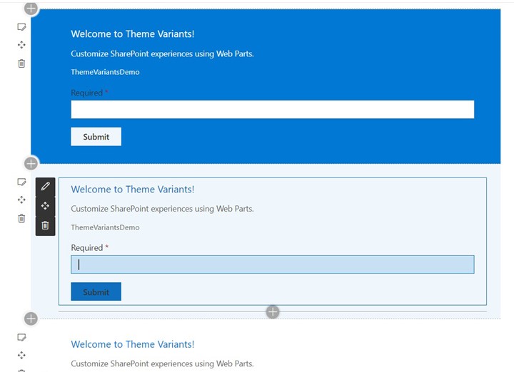
And finally, the result shows how the webpart looks in different section background.
End Note
The above images clearly show that the web part has no dependency on the section background color. The same web part can automatically adapt itself with the changing section backgrounds. Similarly, the “palette” and “semanticColors” of the SharePoint theme can also be used programmatically in SPFX by using CSS in JS.


Above tutorial is giving error when I type gulp bundle –ship command