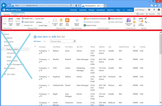
I am on the fence about this new feature of SharePoint 2013. I guess I drank the Kool-Aid about how the ribbon was the best UI invention every, and how your average user will perform 95% of all actions in the first tab. So when I got to play around with the 2013 preview I was ehhh about the ribbon being hidden by default. I had to click on a document then click on the ribbon to get my actions for that document. Introducing an extra click for a user is a little puzzling, but I guess MS got such negative feedback about how “in your face” the ribbon was in 2010 that they had to change it in SharePoint 2013.
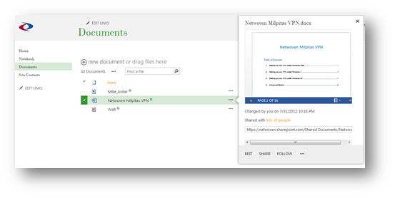
So what is the alternative? SharePoint 2013 gives us a new list of common actions (and preview) in their new Ellipsis feature.  This is probably the answer that will your users are looking for when they come and ask you what happened to the drop down, or how do I access the actions with a single click. As you can see from the screen shot, there are only 3 actions available though (Share, Edit, and Follow).
New Ellipsis options for a word document:
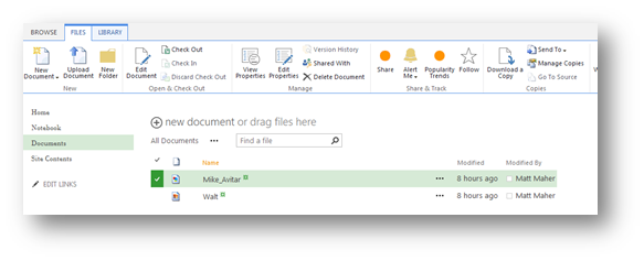
What if your users demand that the ribbon shows when they click on the document? I wrote a quick little script using the new mQuery (see my future post about what mQuery is) that clicks the “Files” or “Items” tab when you click on an item.
EnsureScriptFunc("mquery.js", "m$", function() {m$("#onetidDoclibViewTbl0 > tbody > tr").click( function() {m$(".ms-cui-ct-first > a").click();});});
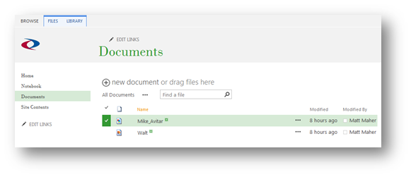
Before:
After:













As a Newbie, I am constantly exploring Online for articles that can be of assistance to me.Thank you