Who should use PowerBI?
Anyone who knows the pain of presenting data in the form of charts/graphs, with added complexity of dynamic filters.
However, if you are a consultant, trust your skills to link even oranges to iPhones…if you ask me how, I’d say iPhones are from Apple, apples and oranges are fruits…any further explanation required 😀 ?
How to understand PowerBI?
At the minimum all you need to know is that each set of raw data/spreadsheet in PowerBI is known as a Field and its representation is termed Visualization.
What is the link between SharePoint and PowerBI?
The first use of PowerBI that you can see in your SharePoint platform is for a health check or maintenance of your SharePoint environment though not much without the help of the SharePoint admin who would run a few reports on the SharePoint farm.
Isn’t this blog relevant to the IT team?
Yeah, IT is always the first team to be blamed if anything goes wrong 😊. Well, while the IT team is diligently working towards implementing SharePoint governance and maintaining organizational security, I bet you’d enjoy maintaining your own set of site(s)/site collection(s) once you have the PowerBI reins, though still with the organizational SharePoint admin support.
How is PowerBI visualization different from other tools?
I’ve used very basic charts and analysis in this article to give a glimpse of how this application can be used, though my data analysis is on the entire SharePoint farm with 3 web applications, to show the complexity of data that can be handled, at the same time making it appealing to readers.
The explanation of the data set is continued in the following sections.
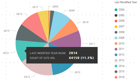
Content Freshness – Count by Year
The freshness of content plays a vital role in picking sites/subsites to migrate. Hence, a Pie Chart is a preferred representation of content freshness information owing to display of count of sites/subsites along with the percentage.
Data Set: All SharePoint Items
- Legend – Last Modified Year (This is Year extraction from Item Last Modified)
- Values – Count of SP Web URL
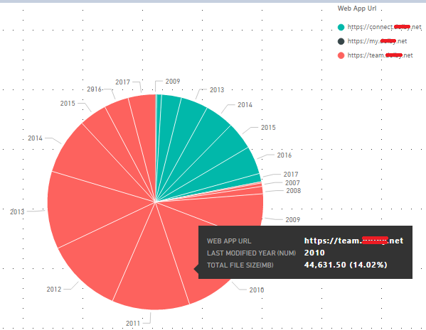
Content Size by Web App and Year
Content size is another deciding factor to estimate duration and effort of migration. Hence, similar to Site Freshness – Count by Year, a Pie Chart suits the representation of split of content size over multiple web apps by year.
Data Set: All SharePoint Items
- Legend – Web App URL
- Details – Last Modified Year (This is Year extraction from Item Last Modified)
- Values – Total Item Size (in MB)
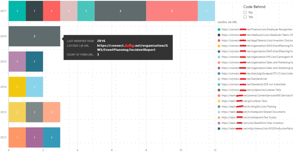
InfoPath Forms
InfoPath forms require a post migration fix, that may also be dependent on code behind the form. As multiple InfoPath forms can exist in a list or a document library, grouping the count of InfoPath forms by list/document library URLs in a Stacked Bar Chart representation helps to view distribution of InfoPath Forms by last access of list/document library. An additional Slicer for Code Behind (Yes/No) filters out lists/library URLs where such forms are used.
Data Set: InfoPath Forms
- Axis – Last Modified Year
- Legend – List/Document Library URL
- Values – Count of Form URL
Workflow Association
Workflows can be split as below:
- Globally Reusable – created on a SP farm level
- Reusable – created on a site collection level
- Non-Reusable – created on Content Type or List/Library. These can be further divided into:
- OOB
- SPD
Reiterating that FastTrack migration might not support an IA redesign, there may be events where Globally Reusable and Reusable workflows may require to be recreated multiple times depending on the SP web containing the list/library associated with them. Similar can be the case with workflows associated with content types if the content types are used on SP Webs that don’t maintain the same hierarchy or are moved to other site collection targets upon migration.
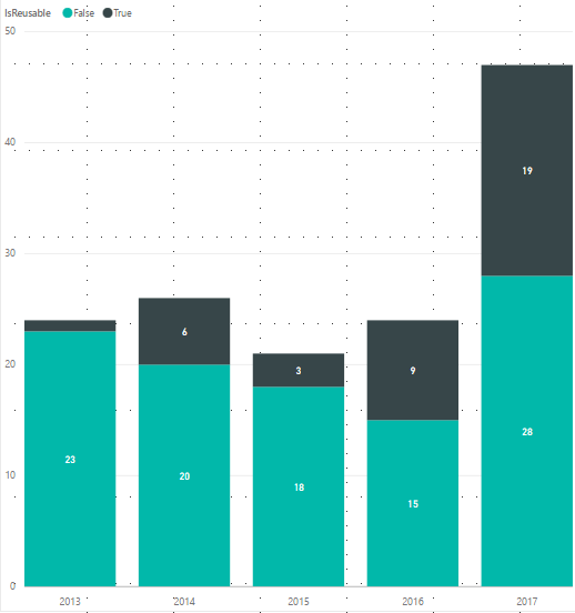
While the actual number of recreations is still a figure that’s awaiting the approved IA redesign, a Stacked Column Chart can be created to check the distribution pattern of workflows on lists over years.
Data Set: Workflow Association
- Axis – Last Modified Year (This is Year extraction from Last Modified Date)
- Legend – IsReusable
- Values – Count of List URL
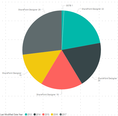
Distribution pattern over time of Non-Reusable workflows can be represented using Pie-Charts with details from the same field as below:
- Legend – Last Modified Year (This is Year extraction from Last Modified Date)
- Details – Type of Workflow
- Values – Count of List URL
What does the raw data look like?
As in my case with the provided examples, I’ve created some content inventory in the form of spreadsheets for my SharePoint application on the farm that serves as input to the PowerBI application.
The following tabulation details all report data with respect to reference by name in Power BI.
|
Data |
Details |
All SharePoint Items |
This table lists all items from all list/libraries across all web apps, and displays the following details corresponding to each item:
P.S.: Some basic filtration is done to remove all system list/libraries before data is loaded in Power BI |
InfoPath Forms |
Report has the following details for all lists/libraries that have InfoPath forms:
|
Site Collection Freshness by Year and Date |
This is an extract from All SharePoint Items report to detail the following:
|
SP Web Freshness by Year and Date |
This is an extract from All SharePoint Items report to detail the following:
|
Workflow Association |
This report includes site collection, SP web and list/document library URLs along with list/library name, item count and last modified date with the following workflow information:
|
How to link data?
PowerBI is smart enough to link different data sets based on uniqueness of columns. The link between different datasets is termed as Field Relationship, which is nothing but a connector between two fields. However, if you don’t desire the default relationships, you could also set up your own.
Since a lot of data filtration depends on established relationships, a few salient features to build fields for setting up relationships are listed below:
- Two fields can be related with only one column
- The linking column must have unique values in at least one of the two fields
- The Cross Filter Direction should be selected as ‘Both’ to allow either way filtration for the two fields
Since this guide is simplistic in nature, the following table helps to establish some basic relationships between various data sets that can be used to enhance level of filtration to check impact and complexity.
|
From: Table (Column) |
To: Table (Column) |
Cardinality |
Cross filter direction |
|
All SharePoint Items (SP Web URL) |
SP Web Freshness by Year and Date (SP Web URL) |
Many to One (*:1) |
Both |
|
InfoPath Forms (SP Web URL) |
SP Web Freshness by Year and Date (SP Web URL) |
Many to One (*:1) |
Both |
|
Workflow Association (SP Web URL) |
SP Web Freshness by Year and Date (SP Web URL) |
Many to One (*:1) |
Both |
Is there more to know?
With the myriad of visualization patterns and filters that Power BI offers to analyze data, it would be unfair to advocate only from the aforementioned patterns for analysis. However, this analysis aims to provide a fair estimate of count and pattern that can further be exploited.
Until my next article where I’ll demonstrate how to get started with the application, PowerBye-Bye!


