Most SPFx applications have grids in various modules like dashboard, tasks, to-dos. There are various third-party grids that can be used in these areas. I have used both UI fabric and Kendo grids in these scenarios. Both are good third-party controls and come with their pros and cons so based on requirement you should decide which one to use.
Application/Usage Areas:
Kendo Grids/Office UI Fabric Grids usage areas:
- Dashboards with different views-Task board, Project board, Resource board all these need various views for different people in different roles viewing the application. In these areas both grids can be used for viewing data with sort, filter, refinement etc features.
- Editable list for resources /tasks/to-dos-Various applications require grids with editable columns for editing tasks, resources, adding new tasks/resources etc. Both these grids can be used in these cases.
- Matrix representations-These grids can be used to show matrix representation of task/resource, project/resource, resource/availability mapping.
- Timesheets-These grids can be used to represent timesheet data entry.
- Listing Data in general-These grids can be used to display lists of data like books, projects, users, machineries etc. One can change view of these lists as per requirements.
Implementation in SPFx Projects:
Below is a set of basic steps for creating both types of grids
Steps to create Office UI Fabric grid in SPFx:
Create a sample basic grid:
- When a SPFx project is created by default all the Office UI Fabric packages get installed. In the. tsx/.jsx file first you need to import the necessary libraries:
import { DetailsList, DetailsListLayoutMode, Selection, IColumn } from 'office-ui-fabric-react/lib/DetailsList';
import { MarqueeSelection } from 'office-ui-fabric-react/lib/MarqueeSelection';
import { Fabric } from 'office-ui-fabric-react/lib/Fabric';- Then you need to place the grid (here DetailsList) in render function:
<MarqueeSelection selection={this._selection}>
          <DetailsList
            items={items}
            columns={this._columns}
            setKey="set"
            layoutMode={DetailsListLayoutMode.justified}
            selection={this._selection}
            selectionPreservedOnEmptyClick={true}
          />
</MarqueeSelection>- In the above sample items is the data array for example:
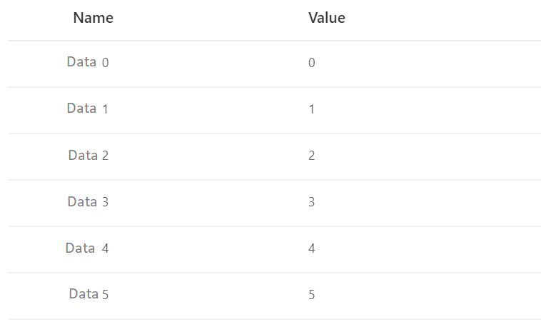
this._dataItems = [];
    for (let i = 0; i < 200; i++) {
      this._ dataItems.push({
        key: i,
        name: 'Data ' + i,
        value: i
      });
}- In the above sample this._columns is the list of columns for this grid:
this._columns = [
      { key: 'col1', name: 'Name', fieldName: 'name', minWidth: 100, maxWidth: 150, isResizable: true },
      { key: 'col2', name: 'Value', fieldName: 'value', minWidth: 100, maxWidth: 150, isResizable: true }
]; - This is a very basic sample of office UI fabric grid. You can make your grid richer by adding sort, filter, context menu, grouping and all sorts of features.
- For elaborate illustrations refer https://developer.microsoft.com/en-us/fabric#/controls/web/detailslist
- The sample Grid looks like below:

Steps to create Kendo React grid in SPFx:
Create a sample basic grid:
- Kendo Grid packages need to be installed in an SPFx application:
npm install --save @progress/kendo-react-grid @progress/kendo-data-query @progress/kendo-react-inputs @progress/kendo-react-intl @progress/kendo-react-dropdowns @progress/kendo-react-dateinputs- In the. tsx/.jsx file first you need to import the necessary libraries after installing the above:
import { Grid, GridColumn, GridDetailRow, GridToolbar } from '@progress/kendo-react-grid';- Then you need to place the grid in render function:
<Grid
                    style={{ height: '400px' }}
                    data={this.state.gridData}
                >
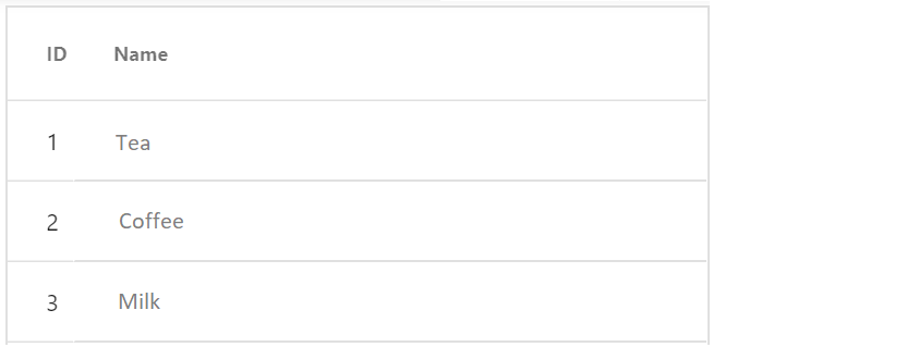
                    <Column field="ProdID" title="ID" width="40px" />
                    <Column field="ProdName" title="Name" width="250px" />

</Grid>- In the above sample state.gridData is the data array for example:
[{
    "ProdID" : 1,
    "ProdName" : "Tea",

}, {
    "ProdID" : 2,
    "ProdName" : "Coffee",

}, {
    "ProdID" : 3,
    "ProdName" : "Milk",

}
Comparison between Office UI Fabric and Kendo grid:
Office UI Fabric grid:
Pros:
- It comes with SPFx package installation. No extra packages need to be installed.
- The look and feel of Office UI Fabric is consistent with SharePoint look and feel. So, UI wise no extra customization is required.
- The controls in Office UI Fabric have features consistent with similar in-built controls in SharePoint. So, when used in SPFx webparts with another SharePoint provided webparts it blends in.
- Documentation for the various Office UI fabric controls is adequate.
Cons:
- It is heavy weight. As a result, the Office UI Fabric controls load slower.
- Customization of controls is tricky as not all events are exposed.
- Need to write too much code (long code) for simple features.
- Not all features are available. For example, I had to choose Kendo over Office UI fabric as I had a requirement for nested grids which was not available in UI Fabric.
Kendo React grid:
Pros:
- It is light weight. The controls load very fast and have good performance.
- Coding is not at all lengthy for Kendo UI controls.
- A lot more controls are available in Kendo than Office UI fabric.
- More events are exposed for customization. On figuring out the correct control and even the customization of code is easy.
- Has different versions for jQuery, angular and so can work in different platforms.
Cons:
- It needs to be installed separately and added to the package. Although trial version is free, the consumer version is chargeable.
- The look and feel needs to be modified with CSS to make it identical with SharePoint controls.
- The features of the controls are not exactly like in-built SharePoint controls and hence customization is required.
- Documentation of the API is not at all good. So, although a lot more controls and events are available it becomes difficult to find the correct ones to use.
Conclusion
Based on project requirements, budgets, team etc you should wisely choose the third-party libraries. Both Office Ui fabric and Kendo are good in their own way. So, it is up to your judgement to decide which one to use.


